Friday, May 29, 2009

Triple Threat

The two bottom pictures are variations on the topmost one. When I saw the original, I thought that when editing it, I could go two different ways: boosting the colors to make it brighter and more cheerful, or fading the color to give it a more dated appearance. Although both work, I personally prefer the second variant for several reasons. I think that the irregular angles and skewed lines, together with the distorted image in the water, give this picture a worn, old-fashioned tone--it actually reminds me of old, neglected buildings in the American West (this picture was taken, like the granite picture, off the West Coast of Sweden). Something I like about digital editing is that, with a single picture, the possibilities are numerous, and consequently, one original picture can be altered to convey several different messages and moods.
Tinny

Thursday, May 28, 2009

Explanation


So I would just like to explain the logo quickly, it really isn't complicated.
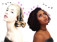
I watch a LOT of videos on youtube and one of the ones I love is Frezned's Capital Loser video from which I learned about MAJUSCULE. Majuscule just means capital letter but I loved the sound so much I told Tinny. It brewed in our conversations for a few weeks and when we finally decided to make this blog, we thought it would be a great name. Since the blog is about our art, we decided on MajusculeA as in A-R-T. Minuscules as you may have guessed are lower case lettters and we thought it would be symbolic, as two insignificant people trying to make something of themselves.
As for the picture itself, it was taken on the same day as all of the other playground pictures, where we used my Sony Cybershot camera to take pictures in burst in the garden of our old elementary school. After these were taken, I chose the best ones and used photoshop to put them together.

[LIONFRO]

On the fence? On the stairs.


Yet another series of pictures from the February photoshoot. I think this more shows Tinny's modeling skills than my photography skills because I really didn't have to do much. The light was fantastic, and Tinny only needed direction when I was being neurotic and felt the need to direct. I put these together because they were the best of the shots on the stairs at our old elementary school. Of course I messed with the saturation, contrast, exposure, and balance of light spots and shadow spots. I may post these indiviadually on a slow day, but since we are going strong at the moment I thought it best to upload in bulk.

<3>
Lionfro

PS. Check out the new watermark in the bottom right hand corner, in the right sidebar

Reality Check

The topmost picture is of a painting I recently completed, and the one below is the digital picture I based my painting upon. I used acrylic paint on canvas after drawing the basic forms. The canvas is only about 11 by 14 inches, which lead to some sacrifices in the background details; I decided that there was so much detail in the foreground that minute details in the background would be superfluous. I am happy with how realistic the jackets turned out, and especially happy that, although not completely lifelike, the faces look rather like in the picture. This being one of my first acrylic paintings, I am excited with the result and have learned important lessons for my next paintings, such as using many different shades on faces and not being afraid of the darkest and the lightest ones because, out-of-place as they may look on the palette, they may be just what is needed for a more realistic look.
Tinny

Fetal Fabulous

So as you will probably notice a few pictures in , my primary medium of photography is people. I almost always mess with them before I post them, so I guess photoshop is also one of my "mediums." This is another set of pictures from the February shoot. The reason these two are together is that they both involve a fetal position. One of the reasons I love them is that with the colour of the asphalt and her super cool outfit it just looks like a rainbow and in the first her eyes are amazing
The other reason is that because of the position and the lighting (which was amazing that day) she looks so innocent and sweet, almost as if we caught her in a private moment, of thought. This is one of those pictures that looks amazing in large size so click the picture if you want to see.
More coming soon!
{Lionfro}

Rock Science?

I used my sister's huge digital Canon camera (I think?) to capture this picture from our boat on the West coast of Sweden last summer. With this picture, unlike the ones I posted earlier, I don't really feel like I had to do much to get a good picture. I saw this rock formation and decided to photograph it, and the simplicity of this picture is part of what I think makes it work. Its other crucial parts, I believe, are the uneven proportions that it is divided into and the multi-toned rosy color together with the blacks and grays. As with the swan picture, it is confusing at first sight, which is something I enjoy about it. But ultimately, it's simply a straight-on picture of a beautiful granite mountain off the Swedish coast--yet its description even makes it sound complex.
Tinny

Words on a Feather

Above is a picture I took of a swan next to the Grand Canal in Dublin, Ireland last year and printed recently in the darkroom. I often find pictures of birds generic, and was disinclined to actually print the bird pictures I had taken along the canal. When I did print this one, however, everyone I showed it to had to take a second look; they had to ask me what it was before seeing it was a picture of a swan. Their confusion about this photograph made me realize that even banal subject matters can be captured in a different light, literally, in order to make something unique. This, I believe, is an inspiring challenge to any artist.
Tinny

Second Edition

This is a picture I took of Lionfro with her digital camera and edited in iPhoto. She is standing on the roof of the Metropolitan Museum of Art in New York City this weekend in the midst of an exhibit by Roxy Paine and is wearing all Urban Outfitters, I believe. I posted both the original and the edited version of this picture because I think that while part of the art in digital photography is the picture, the second half is the editing. In this picture, you can really see how the added contrast and sharpness make it much more interesting.
Tinny

Playful Colours


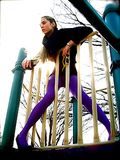
This is a first in a series of many pictures of Tinny that we took one afternoon. She is wearing a pair of my purple tights (from Urban Outfitters), a black sweater and wedges (from Barneys and H&M), and my yellow sunglasses (also from Urban Outfitters). This and many more that will soon be posted, were taken at our old elementary school one afternoon in February.
~Lionfro

Welcome to Majuscule A-R-T


We, Tinny and Lionfro, are the founders of Majuscule A, a blog dedicated to the discussion and display of our own art as well as that of our friends and, eventually, readers. The two of us are longtime artistic creators, having explored various fields and media from early ages. Lionfro expresses her quirky style through watercolor paintings, predominantly photography, video, caligraphy, photoshop, knitting, and original sock monkeys. Tinny utilizes acrylic painting, black and white photography, ceramics, sewing, and drawing as means of expression, along with modeling in New York City. Both of us are extremely creative and repeatedly dabble into new artforms, although not always with the greatest success. Both of us enjoy displaying our work in scholastic art shows and magazines, and from now on, we will be doing so on this blog as well. We introduce MajusculeA (as in A-R-T) to you with that aim, and hope you will enjoy it. <3tinny>